Catalogue is a platform aiming to connect people to the best wine. Due to archaic laws, in Québec, wine and spirits are mostly sold through the government operated corporation and it was previously illegal for establishments to sell them directly to consumers without a meal.
In recent years, laws have been relaxed and during the pandemic, it became legal, hence helping a lot of restaurants to stay afloat by starting to open their wine cellar directly to any consumer.
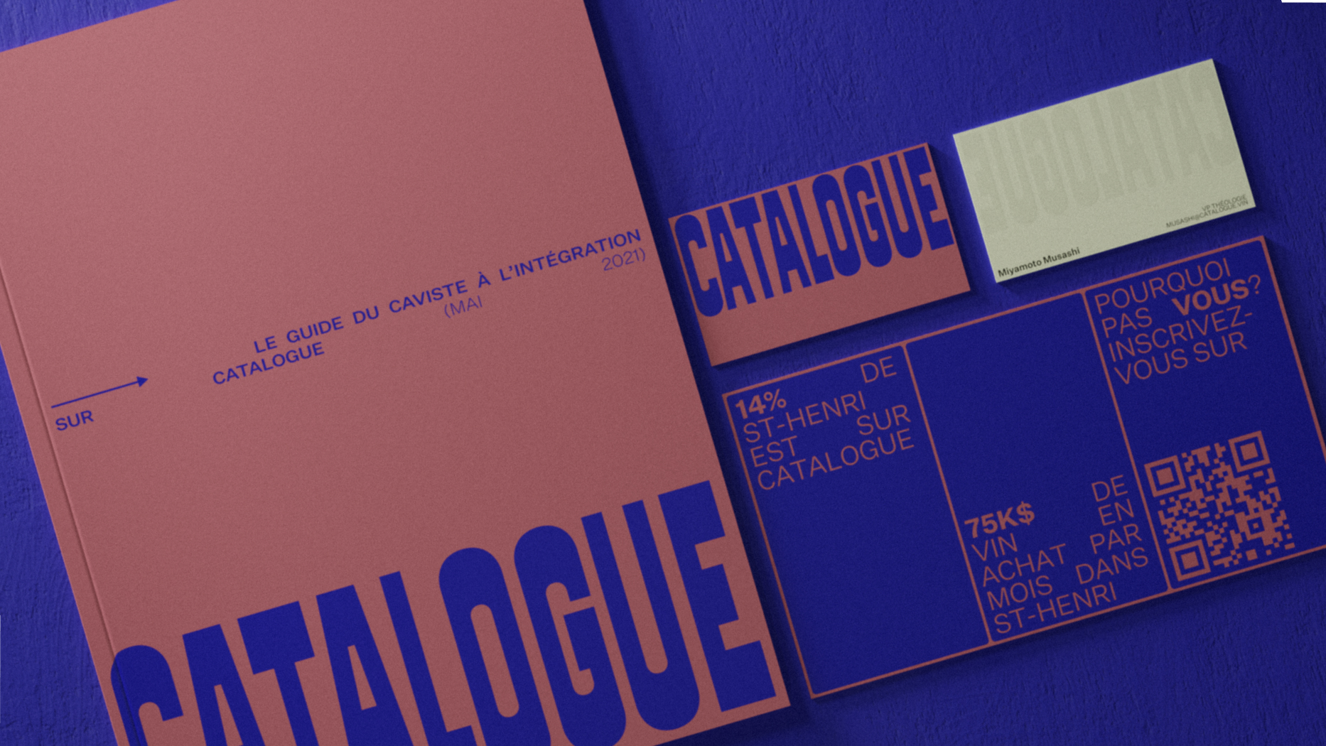
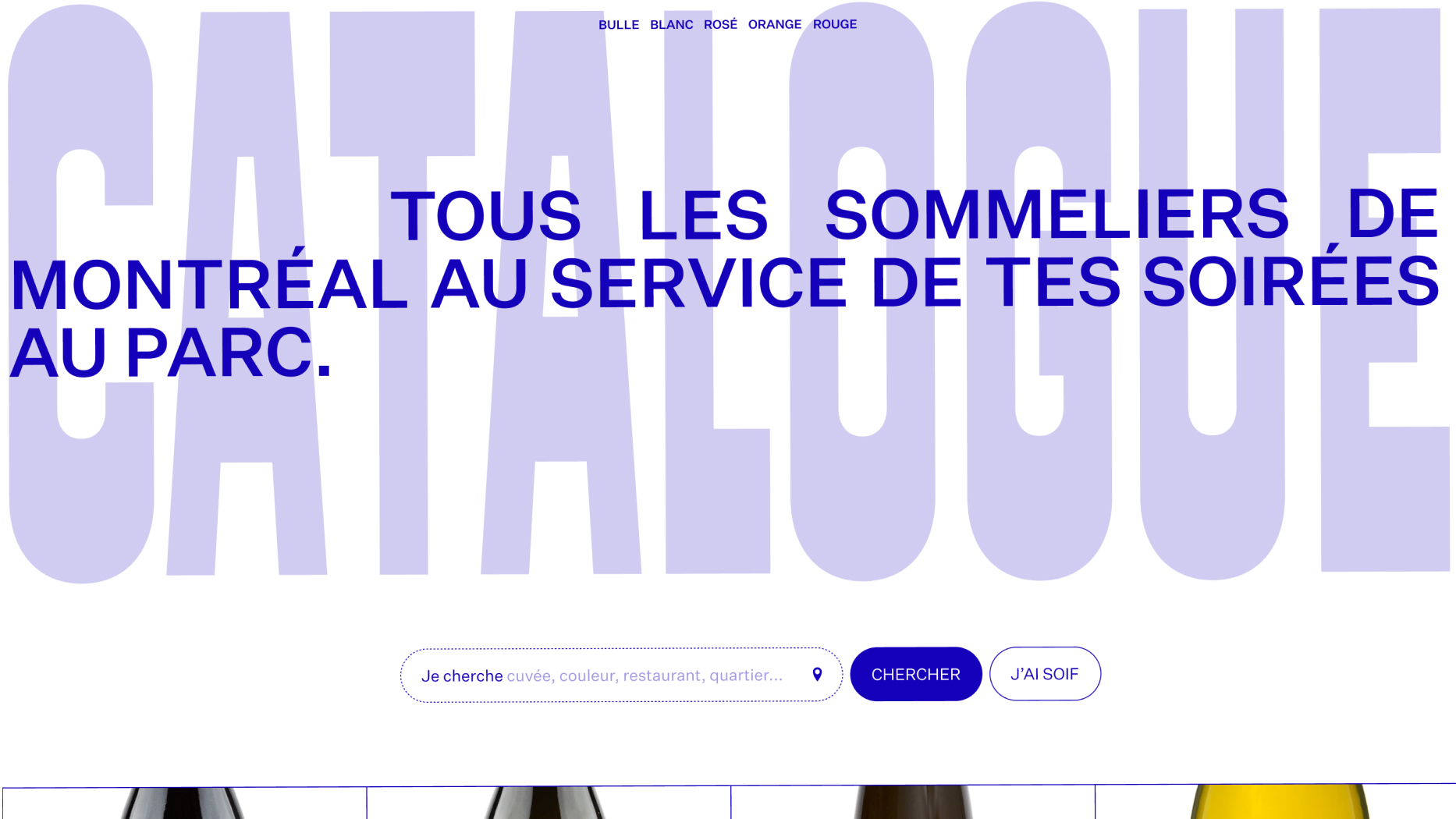
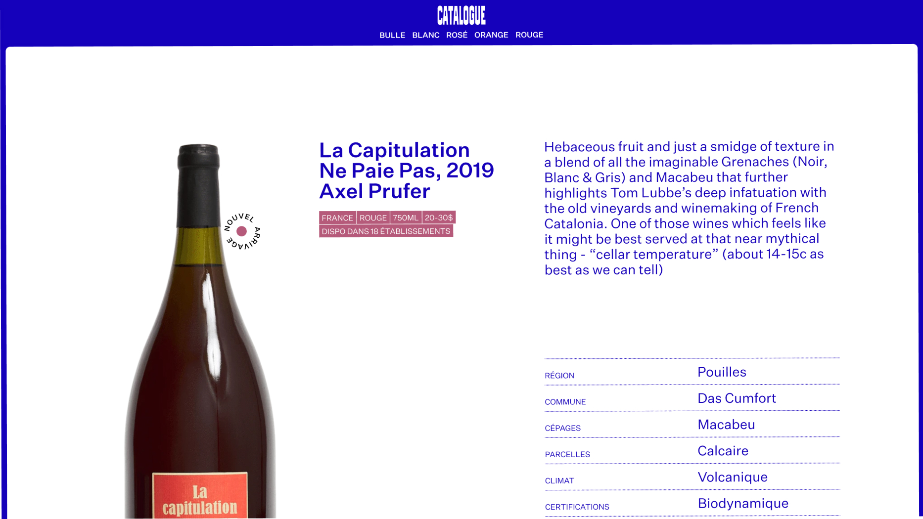
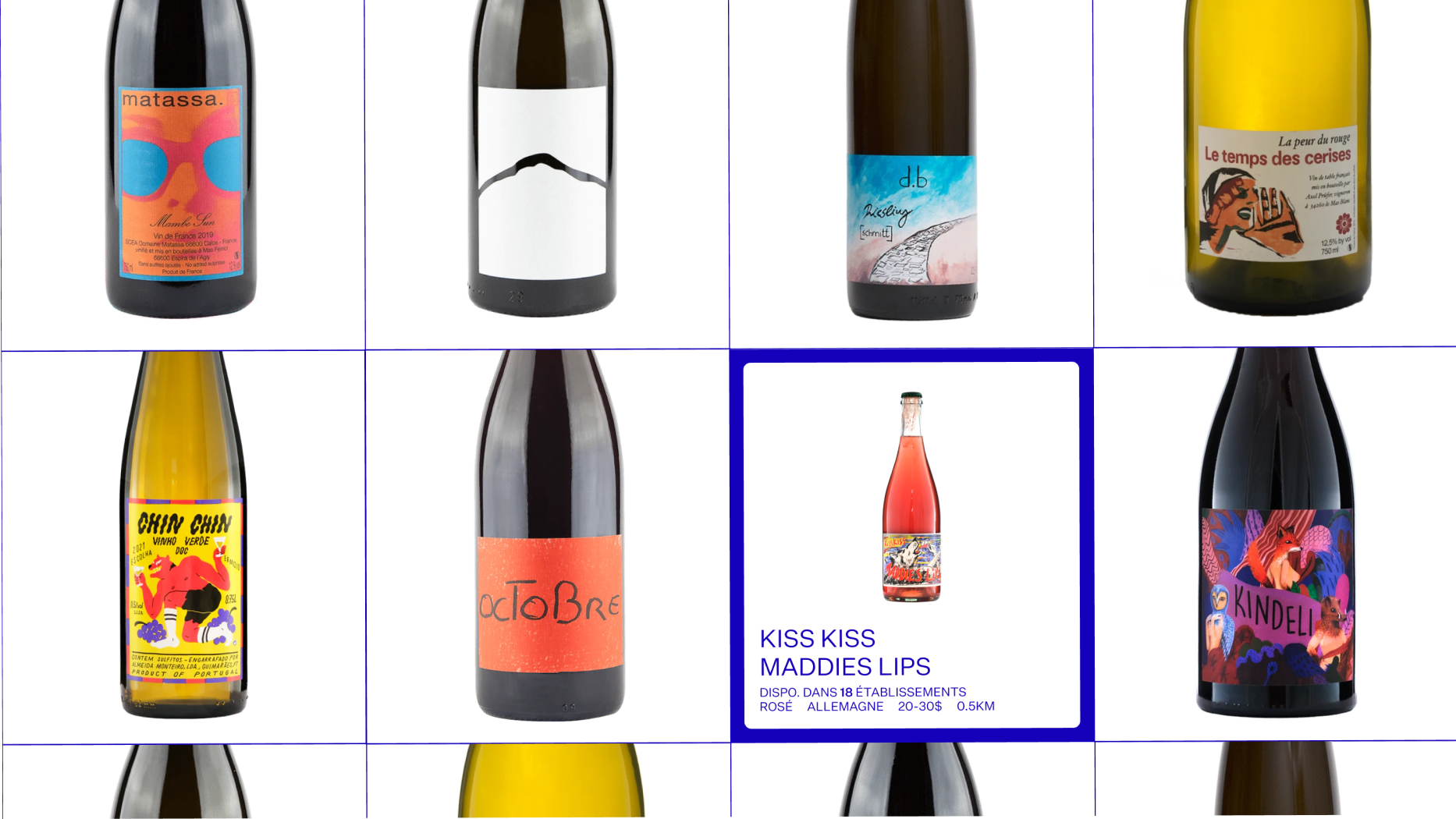
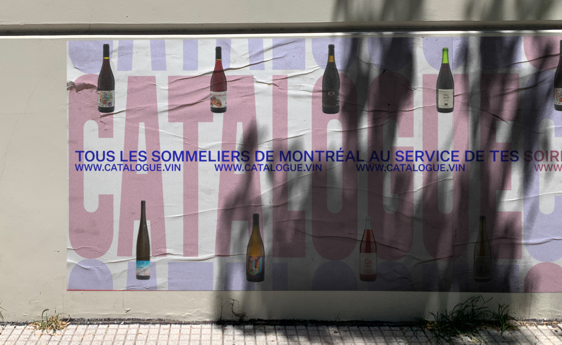
This inspired the idea of Catalogue which is to be an open platform where the establishments can add their cellars and inventory to their profile, making it available for the consumers to find what they’re looking for near them. This would not only help participating businesses to diversify their revenue stream but also help consumers take advantage of carefully sommelier-curated wine selections.