In 2017, I came in contact with natural wine and met a colleague at Unity Technologies, whom I got to inoculate with natural wine fever. A few months later, we came up with an idea: a wine startup, which ultimately, unfortunately didn’t come to fruiton. It was nevertheless a most exciting project in which I was leading naming strategy, brand strategy, art direction, product design & user experience.
Poised to be based in Los Angeles, I quickly came up with Yula as a brand name, inspired by the porte-manteau of Montreal’s and LA’s airport code. It had that bright friendly vibe and could easily be pronounced by anyone, while being unique enough to be memorable, so we adopted it.
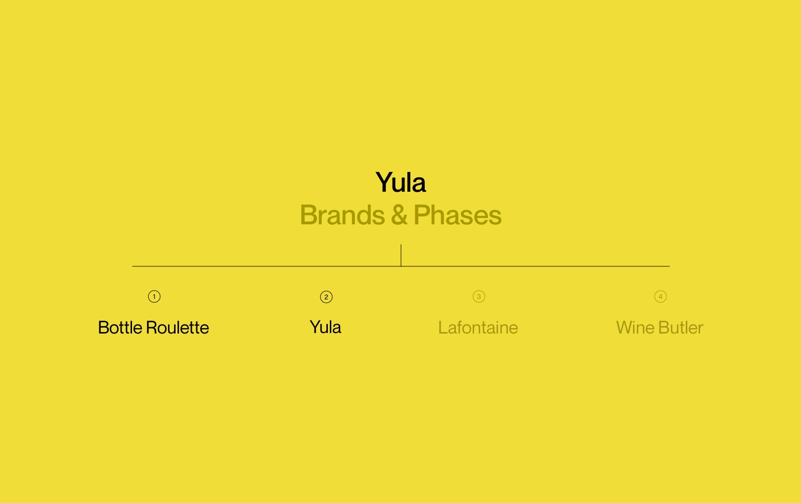
It was a envisioned to become an umbrella brand to different projects aimed at reducing the distance between curious customers and skilled artisans with first idea, the eponym project, being a natural/low-intervention wine discovery and subscription service, but that required substantial market research and serious infrastructure, which is how I came up with Bottle Roulette.
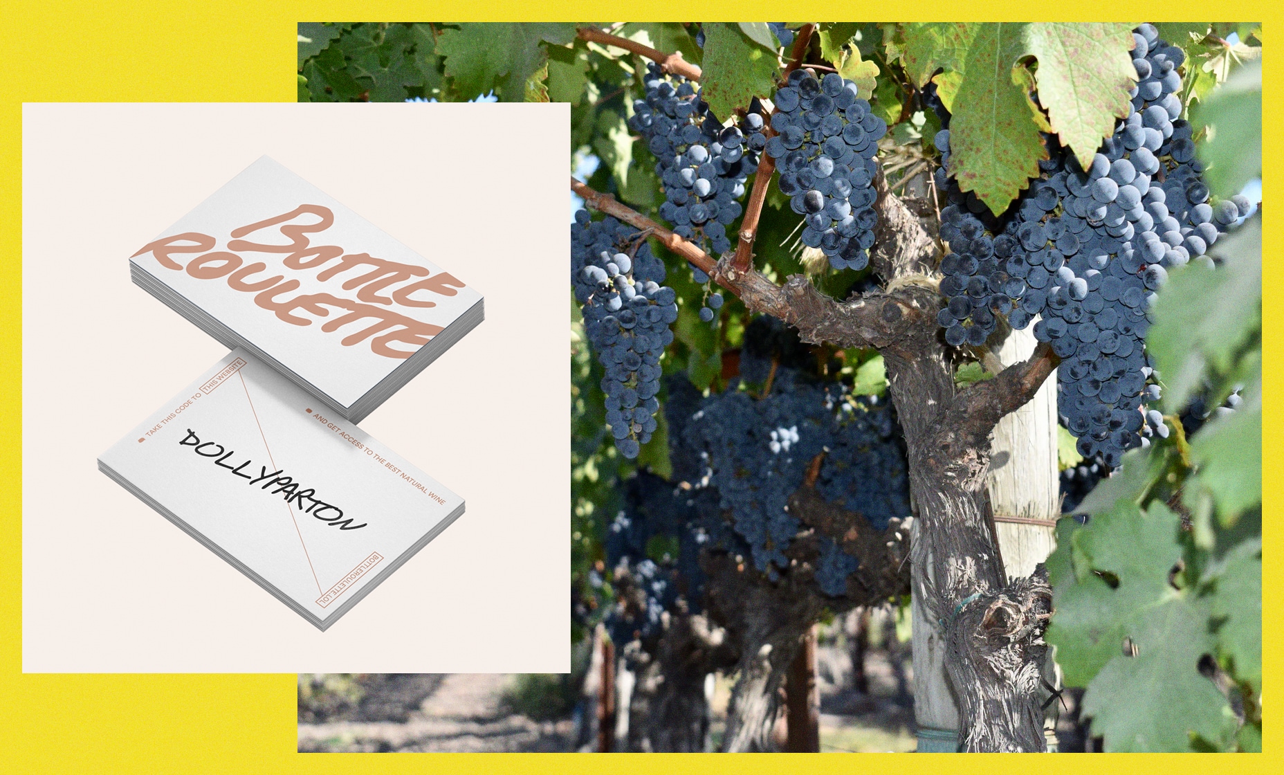
We would print a small batch of cards with one-time access codes handwritten on each which would give you access to buying one of six limited wines that you could shuffle through.
Among other things, the access codes were to be artist names; the wines were to be described using whimsical haikus; the interface was to be very experimental. This was to be, at once, our market research, infrastructure draft and first brand introduction, literally actived through an experience product. We aimed at providing a radically different experience from existing wine commerces and to nurture a following from our upcoming brand.
The design followed a quirky brutalist direction, both on UX and UI, in order to keep the users on their toes and incite them to reconsider how to interact with this odd interface. Things like the secret access code cards, a random current meme appearing and boucing in the viewport to let them know users are also glancing at this limited quantity bottle or rugged design details were part of our intricate strategy to capture our core clientele in the wine market: people eager to discover new, finer things and be part of interesting things regardless of conventions.


